Failing Forward: My Excellent Adventure with Microdata Continues
I was very thrilled to be invited to speak to six classes of seventh- and eighth-grade students at an urban school. Actually, they wanted me to speak to seven classes but there is no way on earth I am getting up at 6:30 a.m. or whatever ungodly hour would be required for me to make it to an 8 a.m. class.
These students live in an area where basically everything you want to be low is high – poverty, crime, unemployment – and everything you want to be high is low – education, income, fluency in English. I spoke to a teacher at a similar school and she said her students were very interested in issues of race and inequality. In her words,
“My students aren’t stupid. They’re getting screwed in America and they know it. There just isn’t anything they can do about it because they’re all, like, thirteen years old.”
Failure #1: Summary Tables
My initial thought was to download the summary tables from the census site, read those into JMP file and create the graphics from there.
I tried downloading some summary tables of those characteristics but concluded after a day of messing with trying to get the data into the format I wanted that it would be far easier to do it in SAS. Now, if you don’t know SAS, it probably would take you more time to learn it than to to just go ahead and use JMP but, hey, at the end you’d know SAS. (Note to self: Learn more about JSL).
Everyone is complaining about the price of SAS products and I have always been at a university or corporation that paid for the license. So, I thought I would actually check the price, and holy shit, this stuff is expensive. I thought perhaps I should see what I could do in OpenOffice spreadsheet on Unix just in case I run out of clients or employers with licenses and have to pay for the software myself. Unfortunately, the spreadsheet application has a limit of 65,000 rows. Also, it occurred to me that if I didn’t have any clients, I wouldn’t have that much need for the software, now would I?
Anyway … the whole summary tables thing didn’t work out because I wanted variables defined more simply than the Census Bureau did, because this is for a middle school class. For example, I wanted two categories, employed and unemployed, rather than the six the census uses.
Failure #2: JMP
I downloaded the PUMS (as in Public Use Microdata Set) from the American Community Survey for California. This is a 1% sample of the state – 352,875 people, to be exact. You can download it as a SAS dataset, which I would recommend.
My initial thought was to download it, do a few data manipulations with SAS, then output it to a JMP file and create the graphics from there. I like JMP in part because it does good graphics easier than SAS and because it runs native on Mac OS. Using a Windows requires moving 45 feet to a computer downstairs or waiting approximately 15 seconds for a virtual machine to open, thus negatively impacting my quality of life by requiring movement or waiting. I am an American, after all.
Hold that thought – I still think SAS to JMP is a good idea but there turns out to be a bit more massaging of the data necessary than I had originally planned.
Success? Data Massaging with SAS
As I mentioned previously, finding how many people are unemployed was not a simple matter of looking at how many people said they were unemployed, although that would certainly seem like a reasonable way to do it. It also seems reasonable to raise taxes on people and corporations making over $10 million a year and fund health care, education and fire departments, but we don’t see that happening, now, do we?
My first thought was to create a dataset that was a subset of the variables I needed in SAS, do a little bit of recoding and then run the graphs using Enterprise Guide. This did not completely work out.
In trying to find a way to use a weight variable in graphs for SAS Enterprise Guide (which I never figured out in the twenty minutes I spent on it), I came across this Freakalytics blog on The Joy of SAS Enterprise Guide. While I agreed with most of his points, one point made by a dissenter in the comment section I have to agree with – SAS Enterprise Guide IS slow. I’m running it under VMware on a Mac with 2GB allocated to the virtual machine and I still have something up in the background like a bid I’m working on, or am answering email while I wait for the next step to pop up. How annoying it is to you no doubt depends both on your work habits and patience. Since I probably think 60 times a day, “Well, what about this?” waiting a minute for each analysis takes an hour of my time each day. Yes, I do remember when we would submit jobs to run overnight and pick up our output and that green and white lined computer paper the next morning. No, I am sure the fact that I was using a dataset with 325,000 or so records didn’t help. Your point being?
I ended up doing some recoding of the data in SAS 9.2, then opened the dataset I saved, with just the variables of interest, in SAS Enterprise Guide. Even though I thought I had done the recoding I wanted in SAS, I still ended up at several steps creating a filter to, for example, only include the working age population, or recoding race to drop the “other” category.
Again, a lot of this was due to my need to reduce the categories to better fit the level of the group to whom I was presenting. Finally, I lumped all the things I needed to recode, subset, etc. into one program and ran that in Enterprise Guide, then went ahead with my analyses.
Three points regarding Enterprise Guide.
First, I had thought maybe I could just take 10% or so of the 325,000 and use Excel or OpenOffice. If it was a random sample, it should do almost as well. One reason I am very glad I did not choose that route that is the MODIFY TASK option in Enterprise Guide. I am constantly wanting to look at results in a different way, and this allows me to do that without starting all over. Inhabiting some parallel universe where this looked like a good idea, Microsoft has made it so the latest version of Office for the Mac doesn’t allow you to record macros. How much does that blow? Answer: A lot
Second, I think the SUMMARY TABLES option is much better than TABLE ANALYSIS for the types of things I needed to do. It just allows a lot more flexibility.
Third, since I didn’t see any way to use a weight variable and then get a percentage in a pie chart, I ended up doing summary tables, outputting the results to a dataset and then analyzing that dataset. I did compare weighted and unweighted results and it really did not make that much difference.
Once I started getting results, was both the fun and the depressing part. Actually doing the statistics is the fun part, but the results were not what I would have if I ran the world. Several times, I have re-run results, or compared them with census data for the state or nation thinking this can’t possibly be right – but it is.
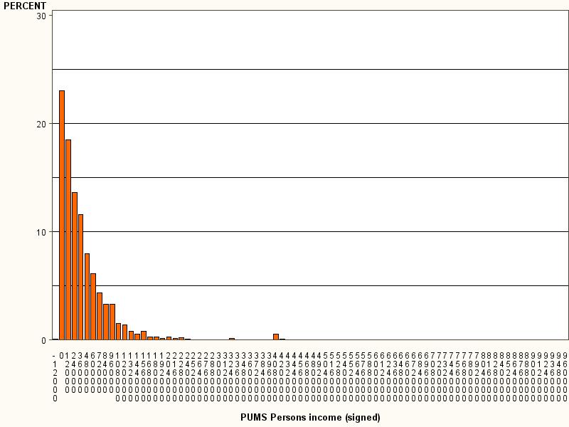
Below is the distribution of income. In California, median personal income, that is, the income for the median person surveyed, was under $24,000 per year. I looked it up in a frequency table to get a more precise estimate and the amount was $20,000. The census gives a more cheery $26,000 or so. The difference is due to the fact that their estimate is based on “full-time year-round workers” whereas mine was based on “people of working age”, which I defined as 18 – 62.
For people who want to believe we have a fairly egalitarian society, this is a pretty depressing chart. And it gets worse …

