Charts with CDC Data- A step by step example
Perhaps you have watched the Socrata videos on how to do data visualization with government data sets and it is still not working for you. Here is a step by step example of answering a simple question.
Is the prevalence of alcohol use among youth higher in rural states than urban ones?
You can click on a link below to go directly to that step.
First, I went to this Chronic Disease and Health Promotion Data & Indicators site.
Second, I selected Chronic Disease Indicators for my health area of interest.
Third, I selected ALCOHOL – which brought me to the screen showing all the columns of data and a bunch of choices.
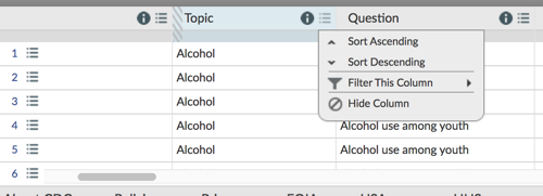
Fourth, I clicked on FILTER on the right of the screen and then select a column to filter by.
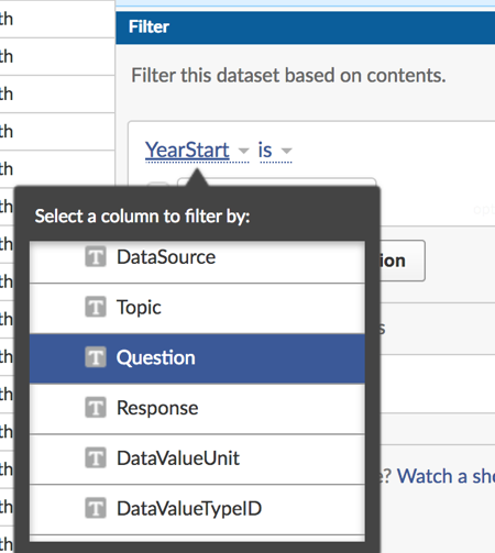
Chrome did not give me a scroll bar so the furthest option I could get was Topic. I switched over to Firefox and was able to get this menu where I selected Question and Alcohol use among youth. You have to type in the value that you want. Make sure it is spelled exactly the same as in the data set.
Fifth, since I wanted to compare urban and rural states, I clicked Add a New Filter Condition and then selected California, New York, North Dakota and Wyoming with LocationDesc as the filter condition. Make sure the box next to each condition you want is clicked on.
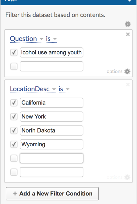 Sixth, I looked at my data, saw there was no data for California and I was sad. Not every state participates in every data set.
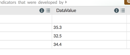 7. So, I decided to compare urban, eastern states wth rural midwest/west and I selected New York, New Jersey, Massachusetts, Wyoming, North Dakota and Montana All had data so I was good to go.
In case you were wondering, I based my choice on the listing of states by urbanization , New Jersey is #2, MA 5 and NY 13
On the other extreme, Wyoming is 39, North Dakota is 42, and Montana 47 so I thought this was a pretty good split.
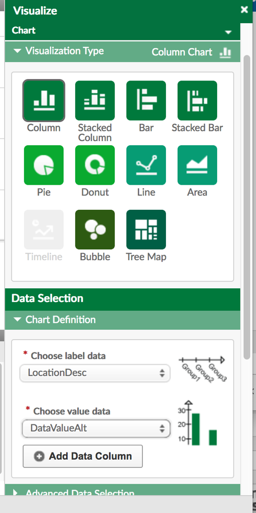
8. I clicked on visualize on the right, selected Column as the type of chart, Location Desc as the label data, DataValueAlt as the data value, and there was my chart
Note: I could not select DataValue. My guess is that was a string variable. I had to select DataValuealt, which was the exact same value
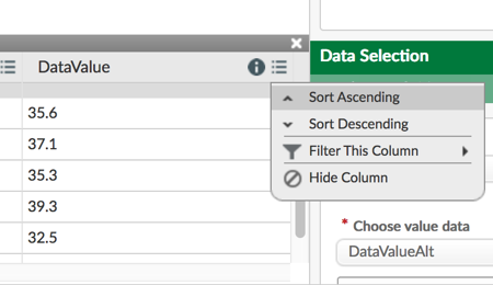
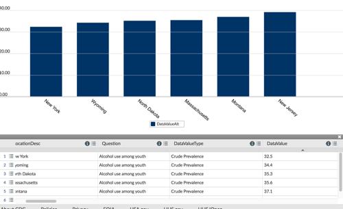
9.Just to make it more obvious, I went in and sorted on data value, which caused the chart to be recreated automatically.
You can see below the chart it created. It’s pretty clear that in these data there is no relationship between urbanization and alcohol use among youth.
New York and New Jersey where the lowest and highest prevalence, respectively. I was hoping to see a pattern with more rural states higher, but it seemed to be pretty unrelated.
HOW TO DOWNLOAD THE DATA SETS FOR ANALYSIS
Perhaps you would prefer to download the data set for import into some other tool, say, Excel or SAS. The first three steps are the same, into you find the data set you want.
This next step is not required , but the data sets can be pretty big, so I’d suggest filtering on at least one major variable first. For example, you can click the three rows next to any column, say, Question, and then select the question that interests you, say Binge Drinking.
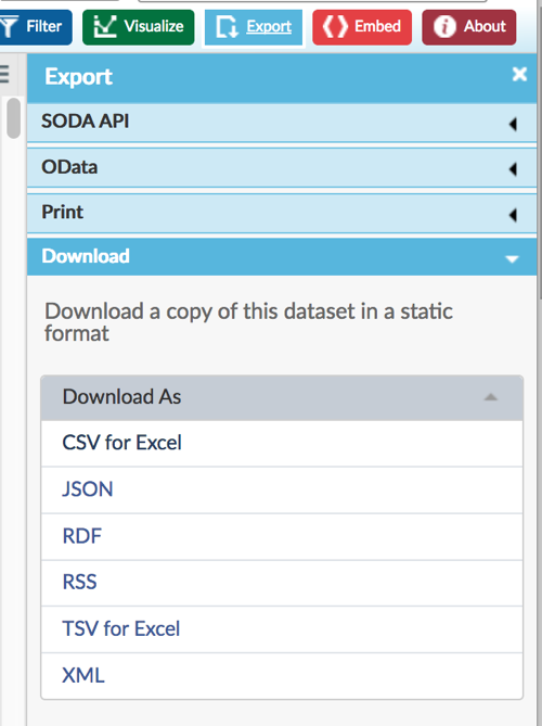
Next, click the EXPORT button at the top right of the screen. Select the format in which you want your file to be downloaded. That’s it!
