Explaining Unexpected Sights
Normally, walking along the beach in the morning with my daughter, I do not expect a random person to come up to us with the question,
“Would you like to ride my camel?”
However, I was not taken nearly as much by surprise as my daughter because I had been to this same beach twice already and although it was deserted both times and, I have to admit, generally much cleaner than the beach at home, there were a couple of piles of, well feces. While distinguishing types of animal feces is not a skill frequently called on in statisticians in Los Angeles, I was pretty certain these weren’t from any small domestic animals or drunken tourists.
I knew there had to be a producer of large feces around here somewhere
So, when the gentleman walked up leading a family of camels, that explained a lot.
After a few hours of camel-riding and sunbathing, I was bored, so I came back up to my hotel room to work on my second paper for WUSS. I already submitted a paper on statistics with Enterprise Guide but I wanted to write something on data visualization, just because, and I figured having a deadline would force me to make some progress.
Now, I knew this was around here somewhere …
Creating a bar graph in Enterprise Guide with bar height = means of a second variable
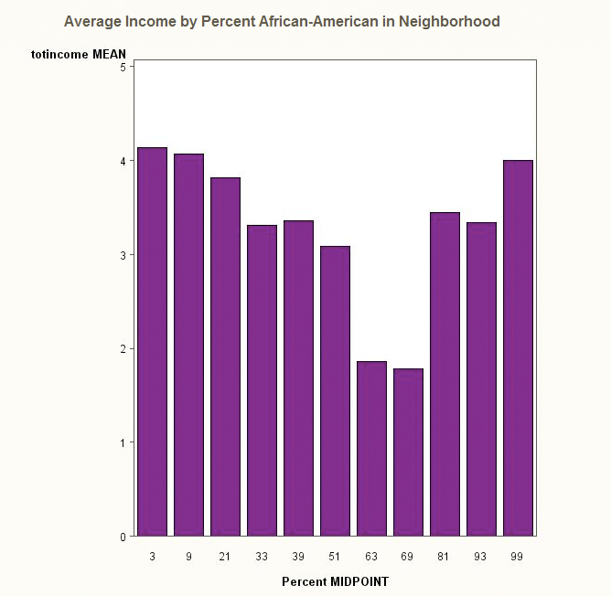
I usually use TASKS > GRAPH > BAR CHART to create a bar chart and I had yet to spot how to create a bar chart which shows the average of one variable for each value of a second variable. In this case, I wanted to see what is the average income for respondents based on the percentage of African-Americans in their neighborhood.
My original reason for using this was to create a bad example and show that you should NOT have 100 categories. As you will see, it did not work out as expected. In fact, it so did not work out as expected that I tried again with percent African-American residents rounded to to the nearest 10% because I wanted to look at these data again.
I was sure there had to be a way to create a bar chart by means, and when I had plenty of time to look for it, I found two. In the BAR CHART task when you select your column to chart, then under “sum of” select the variable for which you want the means. Next, click the ADVANCED option for the bar chart task. You’ll see an option for “Statistic used to calculate bar”. From the drop-down menu, select average.
[You can also use the bar chart wizard. In step 2, select a variable from the drop-down menu next to bar height. Then click on the sum symbol (the thing that looks like a deformed E) and a window will pop up that lets you select average as the statistic.]
So, I get the chart below and I know it is not supposed to be like that.

As can be seen from this graph, there is a curvilinear relationship between the percentage of African-American residents in a neighborhood and income (measured on a 1= < 30K year to 8 = > 250K scale).
While this may be true, I don’t think it is. My first thought is that there are probably a small number of respondents who came from neighborhoods that are 70-100% African-American because this was a random sample of around 1,100 people and there aren’t that many completely segregated neighborhoods in the country.
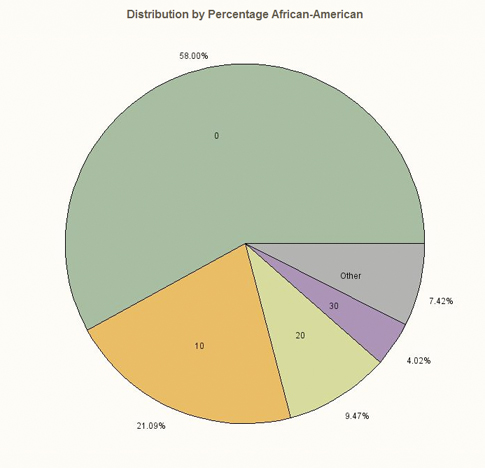
I take a look at a pie chart 
and it confirms my suspicions – those bars to the right which are forming that curvilinear pattern are based on a very small sample. All of those bars from 40% on up, COMBINED comprise less than 7.5% of the total sample.
I have major commitments today – going to the beach, eating breakfast and watching my daughter at training camp, which is the reason we are here in Tunisia.
I am going to look at this more later. I actually did a lot more last night and that is the part that troubles me a bit.
I really looked into this because the results were unexpected. I KNOW I should always examine every aspect of the data carefully, but the truth is, I know that I do more testing, more exploration when the results are not what I expected to find. I wonder to what extent we all do this and how much that contributes to us confirming what we already expected to find, because when we do, we don’t keep looking for other explanations.
I’d like to see the data, because these two charts don’t show it at all clearly. The bar chart should be a step chart, using a continuous variable for X. Perhaps the pie chart should be as well, or perhaps a histogram would be best.
Yes, you are absolutely right. As I said, I just created the first chart (actually with 100 categories) as a bad example of a bar chart & then when it was so unexpected I started looking at it several other ways. I did look at as a continuous variable, a histogram, tables, etc. and the curvilinear relationship doesn’t go away but I believe it is simply an artifact of the huge sampling error you get with very small samples.
I was going to post more on this and examine it more but I ended up going to Carthage to see the ruins and it was all AMAZING. So, it is on my “later” list.