JMP: Three shiny things catch my eye
Hmm … so, Liz, our finance person is incomparably efficient and unfailingly nice, where I am usually efficient and have a reputation for being correct 97.6% of the time (as someone commented on twitter, if it has decimals in it, it must be true).
Between the two of us we just accomplished the impossible task of adding another statistical package for the university-wide license. Getting anything approved at a large institution requires something like the following;
recommendation and agreement to provide technical support (me), request from finance (Liz), approval from person in charge of the budget, approval from person in charge of person in charge of the budget, approval from legal department, sacrifice of a live chicken, dancing naked in the network operations center, signing of the contract with the blood of a unicorn executed by a troll under a full moon.
Well, it might be simpler than that, but not much. Since we have just agreed to increase the number of statistical packages installed by 33% with a 0% expansion in staff (what was I thinking?) it seemed like a good idea to drive down to Carlsbad and check out the JMP Explorer Seminar and see if I could steal any ideas to put up on the JMP website and FAQ which I now need to create (seriously, what WAS I thinking?).
First cool things I will put on the site are a description of the Graph Builder and a discussion of export to flash.
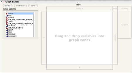
The graph builder is drag and drop on meth.
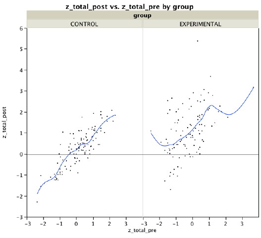
Here, I want to compare the correlation between the pretest and post-test by experimental and control group. I drag pretest to X, post-test to Y and Group to “Group X”.

As I was reducing the size of this graph in Graphic Converter (amazing deal at $34.95 and no I don’t get a kickback from them. I mean seriously, with as much as I talk shit about everything here do you honestly think anyone would PAY me to write about them?) to post here it occurred to me that it would be helpful to have a line that showed the pretest mean so I added that. The whole graph took about 30 seconds.
From my really cool chart here you can easily see that the majority of people in the experimental group scored above the pretest mean (that line) while the control group scored noticeably lower than the experimental group. You can also see that there is, as there should be, a stronger correlation between pre- and post-test for the control group than there is for the experimental group.

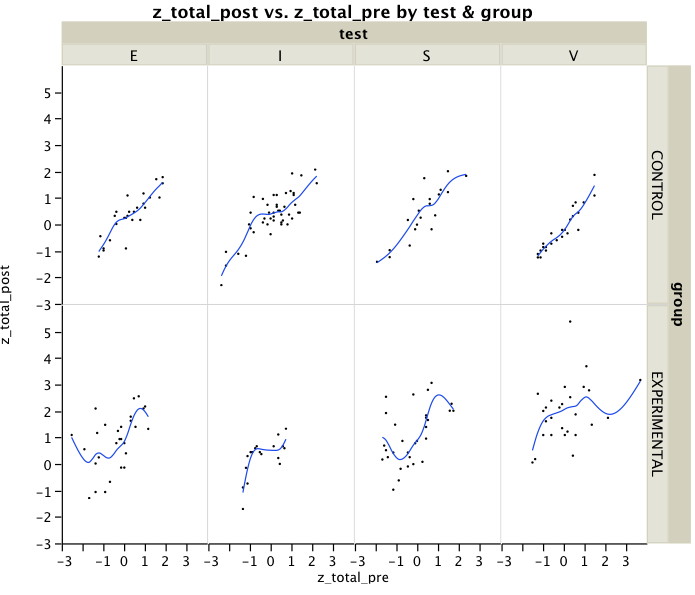
This next chart took just another few seconds to create, but as I looked at it, I realized three things. First, it would be better if I had put the sites in chronological order rather than alphabetical order because the difference between experimental and control was greatest on the last one we did (V) and least on the first one (I). Second, it would have been better if I had grouped by Group (uncreative name) on the X axis and site on the Y axis so it would be much easier to compare them side by side as in the chart above. Third,
**** AND THIS IS A VERY IMPORTANT POINT WHICH SELDOM HAPPENS HERE SO PAY ATTENTION ***
I think there is such a thing as visual literacy. Just like experienced statisticians can look at a cross-tabulation and in their heads estimate (observed – expected) and get a quick appraisal of likely size of a relationship, it takes some staring at visual data, too. The more graphical displays of data, the more I see and the more ideas I get for how to do it better. While this may seem like a blinding flash of the obvious, I mention it here because I have read so many books and articles that say data visualization should not need any explanation. On one level, yes, well, maybe.
However, I think, as with statistics in general, the more you study it, the more you DO see.

Back to JMP, one of the reasons we felt it was important to add it to our campus offerings is that it allows you easily to do those explorations, to look at data from one side and then another (literally). I could have re-done the chart above in seconds. Of course, then I would have had to have opened JMP again, saved the chart, and uploaded it to this site, which would have taken me possibly two minutes. But, I have a quota of three graphics per post so I ate jelly beans for two minutes instead and then included the bubble plot as the last one because it moves, has colors and pointy-clicky things.
You laugh and sneer but lo I say to you that Youtube and Facebook each have hundreds of millions of users and all of Scientific Software International’s Item Response Theory programs put together are used by fewer people each year than the number of pigs sold in one day for Farmville. (Incidentally, Eric Greenspan of Make it Work is my hero for having bought the url www.ihatefarmville.com which redirects to a site with information on him and his company.)
The Bubble Chart — simply include an X value, a Y value and a time value. You can also, like I did, choose a value to color by, and (as I didn’t) a value for the size of the bubble.
Here I have the different test sites (X axis), months of product testing, and score. Since these were just data I had on my computer while I was sitting in the seminar and not something like stock prices or median home prices by state the chart does not look as cool as examples that would apply to this type of visualization. What I want to illustrate here, though, is the fact that in under a minute you can drag in a few variables, then, click on the ubiquitous red arrow. One of the options is to export as flash. Now you have your chart in flash.
Click on it and you can label bubbles, zoom in, zoom out, change the speed, size and other interactive options. Did I mention it took me about 30 seconds? Almost makes me want to re-do it with something other than data I just had lying around.
Now THAT is some kick-ass statistical software when it makes you want to go out and find reasons to use it.
That kind of reaction to software is usually limited to applications that involve shooting people or pornography. However, unlike in those other options, a three-way interaction in JMP will get you neither dead nor a sexually-transmitted disease.
JMP is a great app!!
I’m glad you were able to bring JMP into your workplace. As a loyal SAS user, I was extremely obstinate to bring JMP into the workplace, even though it is owned by SAS. However, once I was able to sit down with the data manager from a large ($25mil) research lab to walk me through the program I fell in love. JMP is by far the easiest program for data management and cleaning. Once you spend sometime with the program you will learn it will never replace SAS but is an amazing addition. Kudos.
Hey there. JMP 9 will be out in a few weeks!
The new geographical map feature in graph builder is particularly sweet.
I’ve got some videos of JMP 9 on my blog. http://vancouverdata.blogspot.com/
Thanks for the tip on JMP 9. I’ll check out your blog. I have another paper to finish on data presentation so it would be nice to end on a “coming soon…” note