Making Statistics Interesting (No, really!) with SAS On-Demand
In a few (okay, a lot) of my previous posts I talked about how you could get set up with SAS On-Demand, problems you might have, programs to run. Now we get to the crux of the matter. Why?
Let’s assume that you are like most professors in America and your students are like most students. In other words, you are teaching statistics to people who:
a) don’t want to learn it
b) consider it boring
c) believe it doesn’t apply to them
d) think it’s too hard
e) all of the above
I am not being disrespectful to my students. If you have ever taken or taught a statistics class, can you honestly tell me that the above does not apply to one hell of a lot of people.
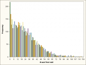
Here, on day one, is a graph from the very first data set analyzed. It’s a chart showing the distribution of medical visits from a sample of people 65 and older.
What questions can you ask based on this?
What observations can you make?
Oddly, I find many people jump right in talking about health care, socialized medicine or aging without ever once pausing to ask what exactly is this variable, which is the FIRST question they ought to ask.
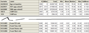
The answer is that it is the total number of internal medicine visits over a nine year period. The first thing the students can see is that most people had very few, even over a nine year period. Then, they can look at the table of descriptive statistics and see that the mean is 24.5 visits even though the mode is clearly 0.
Both this table and the chart above are a result of the CHARACTERIZE DATA task, which is always the first thing I do with any data set if I am using SAS Enterprise Guide. It gives me an overview of the dataset – number of variables, range, minimum, maximum, mean, distributions – and identifies any glaring data entry errors.
This is the point where hopefully one of your students asks if the mode really is 0.It is definitely the minimum, as they can see from the table. It is the highest point, but is that actually zero or is it something like 0-5 ?
This is the part that almost never happens in any statistics or any other math class, the part where the instructor says, “Let’s find out.” (In fact, the modal number of visits over a nine-year period is zero, but that only represents less than 4% of all people over age 65. You can find this out by going to TASKS > DESCRIBE > ONE-WAY FREQUENCIES and selecting the medicine visits variable as your analysis variable.)
So here you are ten minutes into your class and you are already asking and answering questions using statistics.
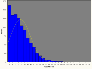
Above we have another chart that shows a normal distributions super-imposed on the distribution for medicine visits. You can see that the distribution is not normal at all. In fact, the left end of the curve is cut off your chart entirely. Thus, you can see that your distribution is positively skewed and non-normal. In a normal distribution, your measures of central tendency are all the same. Mode= Mean = Median. In this distribution the mode = 0, Mean = 25 and median = 21. You get the above chart, measures of central tendency and a lot more by going to TASKS > DESCRIBE > DISTRIBUTION ANALYSIS , selecting the medicine visits variable as your analysis variable, under DISTRIBUTION click the button next to NORMAL and under plots click the button next to Histogram Plot.
A distribution analysis also gives you various statistics to test for normality which you may or may not cover in an introductory course. However, anyone can see in the graph above that part of the curve is missing so that is definitely not a normal distribution.
Maybe everything is like that. Maybe most older people are healthy and there are a few who have a terminal illness, multiple health problems, whatever.
What do you think? Here it comes again … let’s find out.
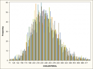
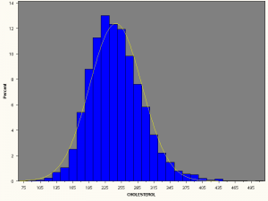
Now here is the distribution of cholesterol. That certainly looks to be closer to a normal distribution. The mean = 245, median = 241 and mode = 230 . When we take a look at a normal distribution super-imposed on the distribution for cholesterol, you can see that it is a heck of a lot closer to normal than the distribution for medical visits.
Hopefully by this point your students are starting to see that this statistics stuff is far from impossibly hard. They may have questions about the distributions of other variables, like blood pressure, BMI or other medically interesting stuff. These are questions they can be assigned to research themselves after you show them how to use SAS On-Demand.
You’ve looked at a couple of variables, but you haven’t yet discussed one of the real uses of descriptive statistics, that is, to describe your sample. Who are these people?
In this particular sample, we have two cohorts, one selected from people who were 65 or older in 1971 and a second cohort of people 65 or older in 1980. A fair number of them had been born in the 19th century. What were these people like? How did they differ from you and me?
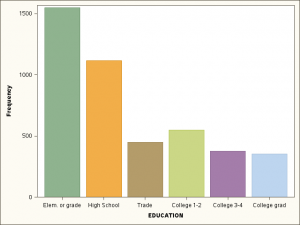
Again, this is an opportunity for your students to ask and answer questions. Many of the answers are in those graphs from the CHARACTERIZE DATA task so you don’t need to run anything at all. Just go to the results and scroll down. For example …
The distribution of education was vastly different. The largest proportion of this population had not finished high school. Far less than 10% had finished college.
We’re working with patients who in many ways were born into a different world than the one we live in. In what other ways might they be different ?
Oops, too late. Class time is over.
If this is the part where students say,
“Wait a minute! That’s not fair. We didn’t find out the answer yet!”
Well, that’s a hell of a good start to a statistics course, don’t you think?
One Comment