SAS EG Weighted Bar Chart to Answer Question on Race & Marriage
Not quite three weeks ago, I wrote about how to do a table analysis using SAS Enterprise Guide to answer the pressing question of whether men are more or less likely to marry women with more education. I was going to follow up with an explanation of how to get a weighted bar chart. Explanation of why it took so long for those of you with intense interest in my personal life follows. For those who don’t care, said explanation is shaded so you can easily recognize and skip right to the weighted bar chart thing.

A few things interfered – not having in-flight wi-fi on the plane home, The Spoiled One getting accepted to Notre Dame Academy, receiving a new grant award, a requirement to file taxes in four (!) states. For a while, every surface in my office looked something like this.
I don’t believe any of the rest of you have to fill out any forms for the rest of the month because I have single-handedly completed the March quota for all of America. Oh, yeah, and I was behind to begin with because of that one daughter winning a world title and other daughter having a baby within the same two weeks thing.
There were also clients who wanted me to do work for actual money.
That, and I ran out of cognac.
How to do a weighted bar chart using SAS Enterprise Guide
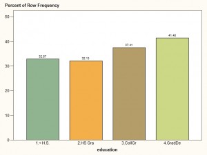
I wanted to do a bar chart, using the weights from the American Community Survey, and graph the percentage of African-American women married at each level of education, that is, within the bars. The question we wanted to answer was, “Does a woman’s odds of being married go up, down or stay the same as she becomes more educated?” Here it is, for you impatient types. The answer is, the percentage of women who are married is greater the higher the level of education. Her odds go up.
1. Get the Data
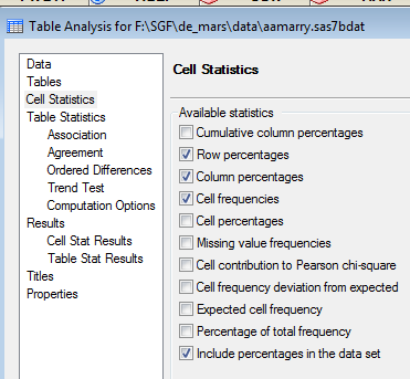
The first step, I did previously (you should have been paying attention). I created a table of marital status by educational attainment using the TABLE ANALYSIS task in SAS ENTERPRISE GUIDE. Notice in that task I clicked on the tab CELL STATISTICS and clicked the box next to Include percentages in the data set.
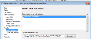
Also, I clicked on the tab for CELL STAT RESULTS and clicked the button next to the table I wanted under Select tables for all cell statistics.
When the table analysis is run, it will create a data set that includes the statistics I specified.
2. Use the GRAPH task to create a bar chart
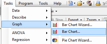
I. Go to TASKS > GRAPH and then select BAR CHART
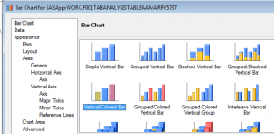
II. The window pops up with BAR CHART TAB highlighted (top of left window pane). Select Vertical Colored Bar because it is pretty.
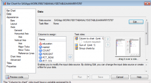
III. Click on the DATA tab. Click on the Edit button (top right of the screen).
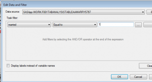
IV. I only wanted to use the people who were married. My data source is already selected. By default it is the last data set I created which, remember, is the statistics from the TABLE ANALYSIS task. I am going to pull down the first box to the variable I want to filter on – married – then pull down the second box to what kind of filter I want – equals to – then, in the third box, type what I want it to be equal to – 1. Click OK (bottom right of the screen).
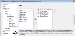
V. Drag education under Columns to chart. Drag PCT_ROW under Sum of. This will chart each category of education. The Y value will be the sum of the values in the PCT_ROW variable. What exactly is the PCT_ROW variable anyway?
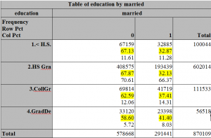
in the table above, which is the output from our TABLE ANALYSIS task (remember that?) the row percent is the highlighted number. Since in Step III, we selected out only those who were married, we will have, for example, 32.87 as our Sum of value for those with less than a high school education.
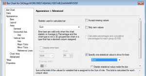
VI. Click on the ADVANCED tab in the left window pane. That is near the bottom. Statistic used to calculate bar has SUM selected. That’s fine. Leave it. On the bottom right, click the box next to Specify one statistical value to show for bars. Sum is already selected.
Guess what? Since you only have one number for each category, it doesn’t really matter whether you select sum or average. In either case, it is whatever the value is for that category, like 32.87.
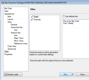
VII. (Optional: If you want some titles, like “Hey, look at my bar chart!” and/or a Footnote, click on the TITLES tab, unclick the button next to Use default text and type whatever you want in the box under it.) Click RUN.
And that, my dear, is how you use SAS Enterprise Guide to do a weighted bar chart for a sub-group of the population.
Your education is now complete.
